How Color Influences Guest Experience in Hotels
Uncategorized Uncategorized
THE PALETTE OF EMOTIONS: HOW COLOR INFLUENCES GUEST EXPERIENCE IN HOTELS
Any hotel lobby will have carefully chosen colors for the walls, furnishings, and other accents. From serene blues to vivid yellows, hotels use color psychology to shape their visitors’ experiences and feelings. The range of feelings that these colors arouse is essential to establishing a warm and enjoyable stay.
This article delves into the intriguing field of color psychology and examines the ways in which various hues affect hotel guests’ experiences. Utilizing the knowledge of psychologists and interior designers, we investigate how color affects mood, hunger, and relaxation. Learn how the mood of hotel rooms, dining areas, and public spaces is shaped by muted tones that encourage calmness and serenity and vibrant tints that generate energy and creativity.
We reveal the keys to establishing a peaceful and welcoming ambiance that appeals to visitors by delving deeply into the science of color perception. Come along as we examine the creative ways that hotels are using color to increase visitor pleasure and create a memorable impression. Whether you work in hotel management or are just an interested traveler, this article offers insightful information about the skill of color choosing in the hospitality sector.
THE PSYCHOLOGY OF COLOR
The study of color psychology explores the deep ways in which colors affect people’s feelings and actions. Different psychological reactions are elicited by each color, which influences moods and perceptions. Reds arouse fervor and drive, while blues inspire serenity and trust. Yellows exude warmth and optimism, while greens are associated with harmony and nature. Subdued colors exude sophistication and lasting appeal. Since color psychology can affect how guests feel in spaces like hotels, it is essential to understand it in design, branding, and other contexts. By utilizing color’s expressive power, one may build environments that convey messages, evoke feelings, and ultimately affect people’s psychological health.
Our emotions and behaviour are greatly influenced by color, and the hotel sector is no exception. The intricate discipline of color psychology examines how various shades might evoke particular emotional reactions. Warm hues, such as red, orange, and yellow, are recognized to elicit emotions such as enthusiasm, vitality, and joy. Conversely, cold hues like blue and green are connected to serenity, peace, and relaxation.
HOW COLOR INFLUENCES EMOTIONS
Our emotional responses to color have their roots in both cultural conditioning and our evolutionary past. While some colors can differ depending on one’s experiences and cultural background, others have been demonstrated to elicit particular emotional reactions in people universally. For example, in many cultures, the color red is linked to passion and love, but in others, it may represent anger or danger.
In the context of hotels, it is essential to comprehend how color affects emotions in order to create the ideal ambiance and visitor experience. Warm colors can evoke sentiments of coziness, enthusiasm, and warmth in hotel design, resulting in a lively and lively atmosphere. On the other hand, cold hues are perfect for spa sections or rooms intended for relaxation and renewal since they can make visitors feel at ease, revitalized, and relaxed.
THE IMPACT OF COLOR ON GUEST EXPERIENCE
Hotel interiors are silently orchestrated by colour, which shapes guests’ feelings and perceptions. Every colour creates a different mood, from bright reds that elicit energy to calming blues that encourage rest. Colour has a significant effect on the visitor experience; it sets the tone, encourages comfort, and produces enduring memories. Carefully chosen colour schemes can improve the impression of neatness, elegance, or cosiness. Colour acts as a non- verbal narrator, creating an immersive and unforgettable tale for each visitor and guaranteeing that their stay is both aesthetically beautiful and emotionally impactful. This can be achieved through the use of relaxing neutrals, vivid accents, or harmonious mixtures.
Hotel guests’ experiences are greatly impacted by colour, which affects everything from initial impressions to level of pleasure. When visitors go into a hotel, the colour scheme determines how they will feel about the place and creates the mood for their visit. While the incorrect colour scheme can evoke anxiety or discomfort, the proper combination makes visitors feel welcomed, at ease, and comfortable.
The colour of the walls, bedding, and furniture in hotel rooms can have a big impact on how well people sleep and unwind. A calm and relaxing atmosphere is created by soft, neutral colours like light grey or beige, which encourages sound sleep. Conversely, vibrant colours can boost vitality and inventiveness, which makes them appropriate for places like offices or public spaces.
USING WARM COLORS IN HOTEL DESIGN
Warm colour schemes like earthy oranges, cosy yellows, and deep reds make rooms in hotels feel like warm, inviting retreats. These colours exude cosiness and intimacy, fostering a welcoming atmosphere that appeals to visitors. Warm colours provide a cosy ambiance that connects with guests, whether they are used as bedding or as highlights in the lobby. These colours, which embrace both heritage and contemporary, give design schemes life and a dependable, ageless look. In addition to improving the aesthetic appeal of hotel rooms, the thoughtful use of warm colours also helps create an unforgettable and emotionally impactful visitor experience.
Warm hues are renowned for their capacity to evoke vigour and enthusiasm. These colours, when used thoughtfully in hotel design, can increase guests’ sense of engagement, welcome, and energy. Warm hues like red, orange, and yellow can help create a bright and cheerful ambiance in public spaces like lobbies and restaurants, which can promote social contact and a convivial feeling.
Warm colours can be employed to create depth and cosiness in hotel rooms. Earthy colours like terracotta or chocolate brown can create a cosy atmosphere that welcomes visitors and makes them feel at home. But, it’s crucial to find a balance and refrain from overpowering the room with strong warm colours, as this might induce restlessness or discomfort.
INCORPORATING COOL COLORS IN HOTEL DECOR
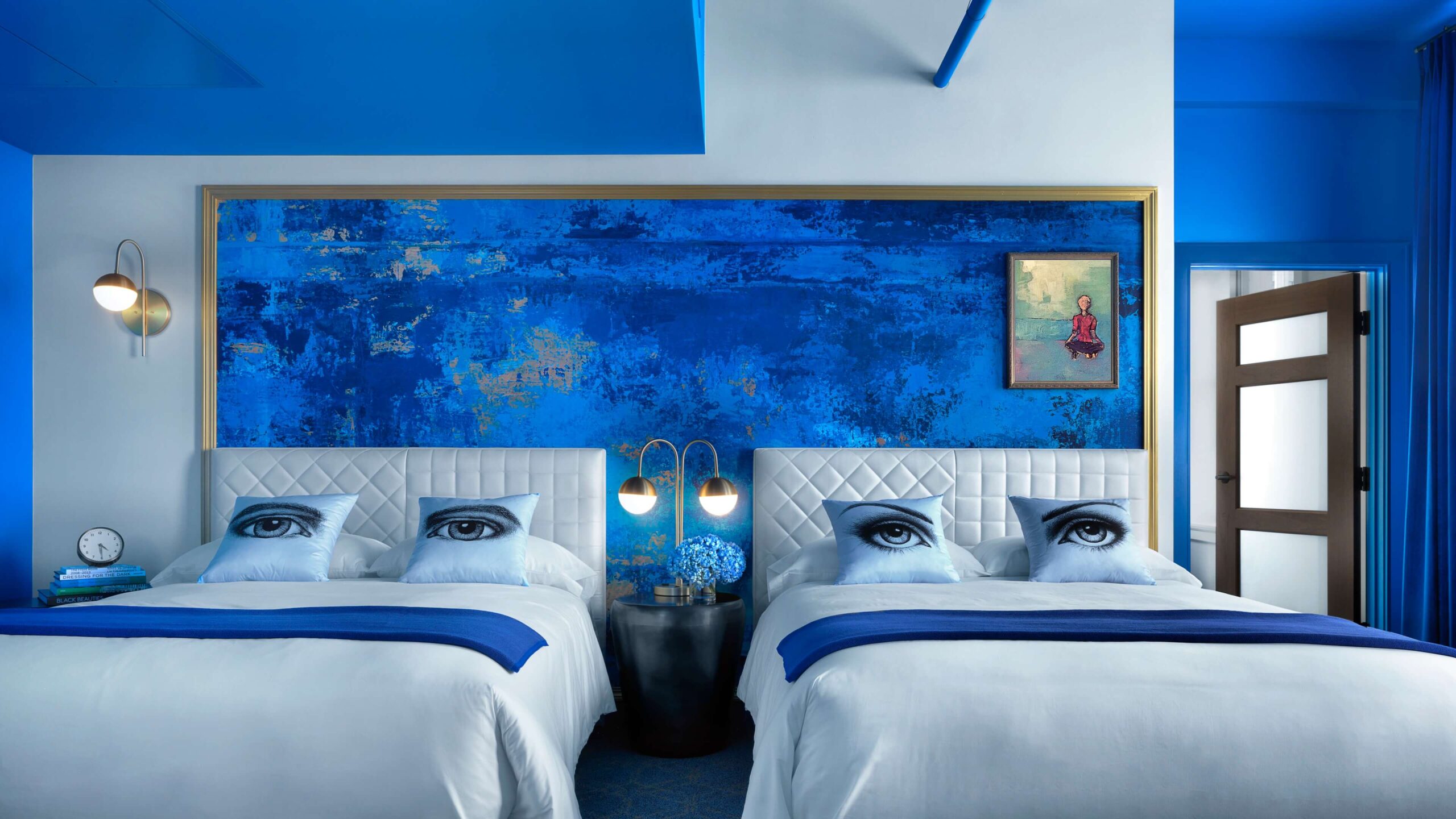
The thoughtful application of cool hues, including peaceful blues and serene greens, creates a revitalising and welcoming atmosphere in hotel design. These colours create an air of sophistication and coolness by invoking feelings of openness and serenity. The calm colours in the foyer and guest rooms create a peaceful atmosphere that invites guests to unwind and enjoy a pleasant getaway. The use of cold tones in accent pieces, furniture, and artwork creates a contemporary yet classic look. Hotels may create environments that are visually appealing and have a soothing, cool vibe to them by utilising the psychological impacts of these colours.
It is commonly known that cool colours can promote a feeling of peace and tranquilly. These colours are frequently utilised in hotel spaces like spas and guest rooms where guests want to unwind and feel at ease. The calming and revitalising ambiance that hues of blue, green, and purple can produce can aid visitors in relaxing and escaping the strains of daily life.
Cool hues help create a calm and relaxing atmosphere in hotel suites. Mild blues or greens can induce calmness and help you have a better night’s sleep. Furthermore, because these hues are frequently tied to the outdoors and nature, they help visitors feel peaceful and connected to their surroundings.
THE POWER OF NEUTRAL COLORS IN CREATING A CALMING ATMOSPHERE
Hotel rooms can be peaceful havens created with the help of neutral colour schemes. Shades of beige, gentle grey, and creamy whites, with their modest elegance, provide a calming palette that is timeless. Neutral colours provide a timeless background that creates a visual haven that promotes relaxation. These colours, which are free of distracting visuals, encourage rest and let visitors forget about the stresses of the outside world. The power of neutral colours resides in their capacity to envelop areas in peace, offering a blank canvas on which a variety of design elements can coexist peacefully, transforming hospitality settings into soothing havens.
hotel design, neutral hues like beige, grey, and white are adaptable and classic choices. These colours offer a blank canvas that is easily combined with other colours to produce a desired atmosphere or mood. In order to foster a tranquil and restful environment that helps visitors unwind and rejuvenate, neutral colours are frequently employed in hotel rooms.
Neutral colours have a relaxing impact as well as a feeling of refinement and elegance. They lend a feeling of balance and neutrality, which makes them appropriate for a variety of tastes and design philosophies. Neutral colour schemes can be made more visually stimulating and welcoming by adding various textures and patterns.
THE ROLE OF ACCENT COLORS IN ADDING PERSONALITY TO HOTEL SPACES
The vivid brushstrokes that give hotel areas life and character are known as accent colours. Beyond the basic colour scheme, well-selected accent colours add personality and vitality to create a unique atmosphere. Accent colours evoke strong feelings in visitors and create lasting impressions, whether they are used in the form of striking furniture, vibrant artwork, or delicate décor pieces. Their ability to arouse feelings of fun, elegance, or cultural richness can enhance an immersive and customised experience. By carefully choosing accent colours, hotel interiors can be made to feel more than just functional—they can be vibrant, welcoming spaces that connect with visitors on a more intimate level.
Accent colours give a place personality and flair, while the primary colour scheme establishes the overall tone of the hotel. Accent colours are frequently used sparingly to draw attention to particular regions or features and add visual appeal. These vibrant bursts of colour can be added with furniture upholstery, decorations, or artwork.
Within a hotel, accent colours can arouse particular feelings or establish a certain mood. For instance, a deep crimson accent wall in a restaurant can create a cosy and intimate eating atmosphere, while a bright yellow accent wall might give vitality and liveliness to a lobby. Accent colours may create a lasting impression on visitors and help make their stay unforgettable when utilised carefully.
COLOR TRENDS IN THE HOSPITALITY INDUSTRY
In the ever-changing world of hospitality, colour trends have the ability to completely redefine the guest experience. Calm greens and soothing blues promote relaxation and peaceful getaways. Earthy neutrals provide enduring style and make flexible backgrounds for traditional design styles. Jewel tones add luxury and enchantment to places while making big statements. Warmth is added with terracotta and rust hues, which also impart a hint of bohemian charm and nostalgia. Modern simplicity is embraced by monochromatic schemes, which highlight design components. In the cutthroat world of hospitality, these trends demonstrate a sophisticated grasp of visitor preferences, transforming lodgings into immersive, eye-catching retreats that make a lasting impression.
In the hotel sector, colour is used dynamically in response to shifting visitor tastes and trends. In order to provide its guests with distinctive and unforgettable experiences, hoteliers are continuously experimenting with new colour schemes and combinations. Earthy greens, warm browns, and soft blues are examples of colours that are inspired by nature and are now in style. The goal is to create a sense of harmony and connection with the natural world.
Using strong, vivid colours to convey a feeling of enthusiasm and energy is another new trend. Hotel owners are using unusual colour schemes, like vivid oranges, deep blues, or rich purples, in order to stand out and establish their own visual style. These vivid hues can be employed as highlights or accents to provide visitors an unforgettable, Instagram-worthy experience.
CONCLUSION: HARNESSING THE POWER OF COLOR FOR A MEMORABLE GUEST EXPERIENCE
Colour is an effective technique that has a big impact on hotel visitors’ experiences and feelings. Hotels may create a distinct environment and atmosphere by strategically utilising colour, ranging from warm tones that energise and engage to cold tones that rest and refresh. Hotel managers and owners may create environments that engage with customers and make a lasting impression by carefully considering colour psychology.
Colour trends will change and evolve with the hospitality business. Nonetheless, the significance of establishing a warm and unforgettable visitor experience never changes. Hotels may design environments that not only satisfy the practical demands of visitors but also arouse feelings, promote connection, and produce lifelong memories by utilising the power of colour. Thus, the next time you enter a hotel, pay more attention to the colours that surround you and recognise the care and consideration that went into their choice.

Sutanaya Dutta
Assistant Professor, School of Hospitality and Hotel Management Geeta University, Panipat

Related Posts
Unveiling the Power of the Semantic Web
The emergence of the Semantic Web as a revolutionary force in the wide terrain of the internet, which is characterized by the constant flow of information, heralds the beginning of a new age of intelligent data representation and retrieval. Sir
An Overview of Block chain Technology and Its Applications
An Overview of Block chain Technology and Its Applications Introduction A wide variety of companies have shown a great deal of interest in blockchain technology over the course of the past few years. It has the ability to revolutionize the